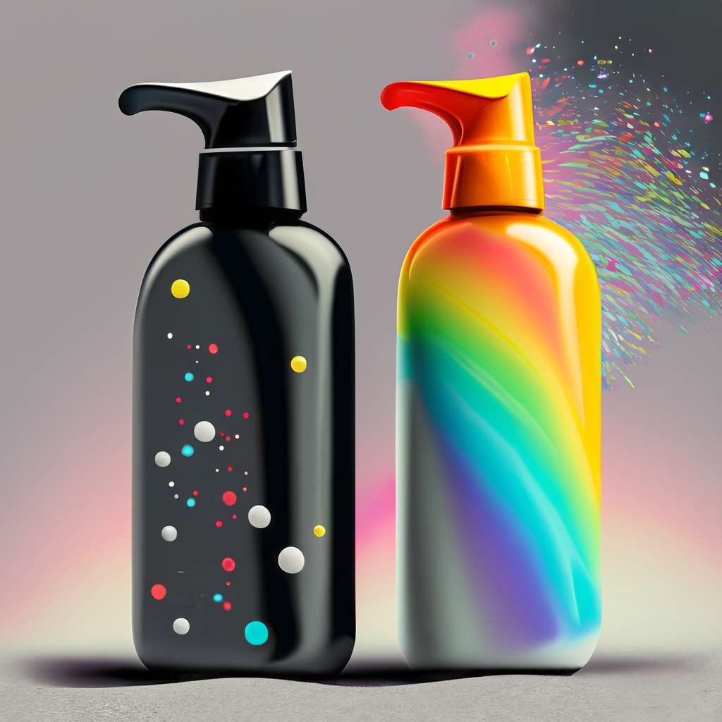
The Transformative Power of Color in Business Branding and Marketing
Step into the enthralling world of color where every shade tells a story triggers an emotion, and silently drives business decisions. For an entrepreneur just embarking on their journey or a seasoned CEO at the helm of a vast enterprise, understanding the nuances of color psychology can be the game-changer your business needs. Ever noticed how a splash of red on a ‘Sale’ sign compels you to stop and look? Or how the blue of a tech brand logo instantly fosters trust? These aren’t mere coincidences. They’re meticulously crafted strategies backed by the science of color psychology.
Breakdown of Color Psychology in Graphic Design
Red: A bold choice in design, red evokes strong emotions. It signifies love, intensity, and passion. It’s attention-grabbing and can even increase the heart rate, making it perfect for ‘call to action’ buttons or sale signs.
Blue: A top choice for corporate designs, blue promotes calmness, trust, and reliability. It’s synonymous with stability and security, often used by banks and tech companies to inspire confidence.
Yellow: This vibrant hue stands for happiness, warmth, and energy. Its stimulating nature can enhance mental activity, making it great for innovative brands and advertising.
Green: Representing nature, growth, and balance, green is soothing. Brands that champion environmental causes often utilize green to signify renewal and sustainability.
Purple: Luxurious and regal, purple is linked with luxury, royalty, and creativity. This color can give your design a touch of elegance or inspire a sense of mysticism.
Orange: A lively blend of red’s energy and yellow’s happiness, orange denotes enthusiasm, excitement, and energy. It’s vivacious, making it a popular choice for youthful and energetic brands.
Black: Timeless and versatile, black speaks of power, elegance, and mystery. In design, it adds depth, contrast, and often complements other colors, amplifying their impact.
White: The epitome of simplicity, white represents purity, cleanliness, and clarity. It offers a sense of space, making designs feel open and uncluttered.
Brown: Grounded and reliable, brown evokes feelings of stability and comfort. Ideal for organic and handcrafted brands, brown adds a touch of earthiness to designs.
Pink: Soft and tender, pink is all about romance, love, and gentleness. It’s versatile, suitable for playful brands and those aiming for a soft, calming ambiance.
Consumership And Color
Colors and The Buying Journey
The journey from an onlooker to a buyer is a nuanced dance of emotions, perceptions, and decisions. Colors play a pivotal role in this journey, either hastening the process or completely halting it.
First Impressions Count: Research indicates that consumers make an initial judgment about a product within 90 seconds, and 60-90% of that judgment is based on color alone. A company’s product packaging and design can therefore make or break a sale.
Example: Cadbury’s distinct purple on their chocolate wrappers is instantly recognizable and has often been associated with a luxurious, indulgent experience. This instant brand recognition prompts many to pick Cadbury over other brands on the shelf.
Invoking Urgency and Excitement: Some colors, especially brighter ones, create feelings of urgency. They can be particularly effective for clearance sales or limited-time offers.
Example: Fast food chains like McDonald’s and Burger King predominantly use red in their logos and branding. Red not only grabs attention but also creates a sense of urgency, making people more likely to stop and make a purchase.
Building Trust and Reliability: Certain colors, especially shades of blue, are seen as trustworthy, dependable, and secure. They are used frequently by banks, insurance companies, and other businesses where trust is paramount.
Example: Many tech companies and banks, like IBM and Chase, use blue to convey trust and dependability. When consumers see these colors, they subconsciously feel a sense of security and reliability with the brand.
Evoking Emotion and Memory: Colors can stir emotions, reminding consumers of past experiences and memories. This emotional pull can influence purchasing decisions by creating a sense of nostalgia or belonging.
Example: The use of green in the branding of stores like Whole Foods and brands like Seventh Generation invokes a sense of eco-friendliness and health. It reminds consumers of nature, health, and wellness, driving them towards making a purchase that aligns with these values.
Segmenting Market: Some brands specifically use colors to differentiate themselves and appeal to specific demographic segments, like gender or age.
Example: The use of pink in Victoria’s Secret branding is deliberate, appealing primarily to a female demographic and evoking feelings of femininity and allure.
Branding/Logo Design And Color
How to use color across various business verticals
When it comes to branding, first impressions matter. Consider how Apple’s minimalist white logo or Starbucks’ iconic green emblem quickly became synonymous with their respective brands. A brand’s logo can be likened to its initial handshake with the consumer—a visual introduction that sets the tone for everything that follows. Central to this visual handshake is the color or palette chosen. But how do you pick the right one?
A Step-by-Step Guide to Choosing the Right Color for Your Brand/Logo
Understand Your Brand’s Essence: Before picking a color, you must understand the core of your brand. What values does it stand for? What promise does it make to its consumers?
Research Color Psychology: Every color elicits different emotions and perceptions. For instance, blue often evokes feelings of trust and stability, while red can signify passion or urgency.
Analyze Your Target Audience: Different cultures, demographics, and age groups can interpret colors differently. Ensure your choice resonates with your primary audience.
Check Out the Competition: While you want to stand out, you also don’t want to alienate your brand from its industry. See what colors your competitors are using and consider how you can differentiate while staying relevant.
Test Multiple Variations: Before finalizing, create multiple logo variants and solicit feedback. This can help you gauge public perception and ensure your choice is effective.
Do's and Don'ts of Choosing Logo Colors
Do consider scalability. Your logo should look great both in black and white and in color.
Do maintain consistency. Once you pick a color scheme, stick with it in all branding materials.
Don’t pick colors just because they’re trendy. Trends fade, but your brand should be timeless.
Don’t use too many colors. This can dilute the impact and make your logo look cluttered.
The Power of a Strong Color Scheme in Branding
A well-chosen color scheme isn’t merely aesthetically pleasing; it serves functional purposes too:
Recognition: A unique color scheme can make your brand instantly recognizable, even from a distance or in a crowded marketplace.
Emotional Connection: Colors elicit emotions. A thoughtfully chosen palette can create a deep emotional connection with your target audience.
Consistency and Trust: A consistent color scheme across all touchpoints establishes a sense of reliability and trustworthiness.
Color And Photography
Crafting Desire through Luxury: Colors like deep purples, golds, and rich blues in product photos can evoke a sense of luxury and exclusivity. They make the viewer aspire for the product, seeing it as a status symbol or a mark of sophistication.
Example: High-end brands like Rolex and Louis Vuitton often use these colors in their campaigns, making their products appear not just as mere possessions, but as coveted treasures.
Stirring Nostalgia with Vintage Tones: The play of muted colors, sepia tones, or even black and white can take the viewer on a journey back in time. These tones evoke feelings of nostalgia, making products appear timeless and classic.
Example: Brands like Levi’s, with their legacy rooted in history, often employ vintage tones in their campaigns to remind customers of the brand’s heritage and enduring style.
Creating Urgency with Bright and Bold: Vibrant colors, especially reds and oranges, can create a sense of immediacy and urgency in viewers. This color strategy can be particularly effective for limited-time offers or new product launches.
Example: E-commerce platforms like Amazon and eBay often use bold colors in their flash sale campaigns, urging users to act fast and grab deals.
Evoking Tranquility with Pastels: Pastel shades, with their soft and calming aura, can convey serenity, purity, and simplicity. They’re perfect for products and brands that promise a peaceful and harmonious experience.
Example: Wellness and skincare brands, like Neutrogena or Aesop, use pastel colors in their product photography to emphasize the gentle and nourishing nature of their products.
Drawing the Adventurous with Vivid Contrasts: High-contrast photos, especially those with stark differences like blacks and bright colors, can attract the adventurous and the bold. They signify dynamism, risk, and thrill.
Example: Sports brands like Nike and Red Bull employ high contrast in their photos to appeal to the adrenaline junkies and the ambitious, portraying their products as essential tools for the bold endeavors of life.
The Profound Influence of Color in Product Photography
Guiding Perception: The right color palette can elevate a product, making it appear more luxurious, durable, or even eco-friendly.
Stirring Emotions: Colors can make viewers feel calm, excited, nostalgic, or even adventurous. These emotions can greatly influence purchasing decisions.
Enhancing Memorability: A product photographed with a distinct and fitting color scheme becomes more memorable to the viewer.
Do's and Don'ts of Using Color in Product Photography
Do consider the background. Sometimes, a neutral background can make the product and its colors stand out more vividly.
Do maintain brand consistency. The colors used in product photography should align with the brand’s overall color scheme and identity.
Don’t overpower the product. While playing with colors can be fun, the product should remain the primary focus.
Don’t forget post-processing. Editing software can help fine-tune colors to get the desired effect.
Marketing & Color
Impact of Color on Engagement and Conversion
In marketing, colors play a role far beyond mere aesthetics. They wield the power to evoke emotions, influence behavior, and shape perceptions. Colors in marketing visuals don’t just determine the attractiveness of an ad but significantly influence click rates, engagement, and even conversion. For instance, yellow can create a sense of urgency, driving impulsive buys, while delicate hues like lavender might suggest luxury and elegance, beckoning customers to indulge and luxuriate.
A Step-by-Step Guide to Choosing the Right Colors for Your Marketing Campaign
Define Your Campaign’s Objective: Are you aiming for immediate sales, or is your goal to promote brand awareness? Your objective will influence the emotional response you want to evoke.
Study Your Target Demographic: Different audiences react differently to colors. Age, gender, culture, and personal experiences all shape color perceptions.
Utilize Color Psychology: Get into the psychology of colors to understand the feelings and actions they might prompt. Remember, however, that color psychology is a guide, not a strict rulebook.
Consider Seasonality and Trends: While core brand colors should remain consistent, campaign colors can be tweaked based on seasons, holidays, or current trends.
A/B Test Your Campaigns: Launch multiple color variations and analyze which one achieves the best results. The data will often surprise you.
The Crucial Role of Color in Marketing Campaigns
Attention-grabbing: In a sea of content, the right color combinations can make your campaign stand out and capture attention.
Emotional Resonance: Colors can set the mood of your campaign, whether it’s the excitement of a sale or the calm assurance of a luxury product.
Action-Driving: Colors can drive action. The urgency of reds, the trustworthiness of blues, or the eco-friendliness of greens – each has the power to push the viewer a step closer to conversion.
In Conclusion
In the realm of business branding and marketing, color is not a mere aesthetic choice; it’s a strategic tool with profound influence. From the urgency instilled by red in sale signs to the trust evoked by blues in tech logos, understanding color psychology is essential for brands to resonate with their target audiences. Whether it’s leveraging Cadbury’s purple for luxury or Whole Foods’ green for eco-friendliness, color shapes perceptions, emotions, and ultimately, consumer decisions. As businesses embark on their branding journeys, it’s crucial to delve deep into the world of colors, analyzing target demographics, understanding brand essence, and considering industry trends. To truly harness the transformative power of color, brands must be thoughtful, strategic, and consistent in their color choices. Take a moment to review your brand’s colors: are they telling the story you want? Dive deeper, experiment wisely, and let color be the game-changer for your brand.
Help Your Friends, Share This post!